Simple but Effective Skeleton Loaders
Skeleton loaders are a simple and effective way to display a user interface before data has loaded. Instead of showing an uninformative loading spinner, they allow users to orient themselves and anticipate where relevant information will appear.

Although building a skeleton loader isn’t overly complicated, I didn’t find a solution that ticked all the boxes. I tried a few approaches and eventually came up with something I really like.
If you’re not interested in the explanation, head over to the final code.
Requirements and Concept
The existing solutions I found generally fall into two categories:
- They offer basic primitives to define placeholder shapes, or
- They use SVGs, allowing any custom shape to be drawn.
I wasn’t satisfied with predefined shapes because I want my skeleton loaders to closely resemble the actual UI. For the same reason, I wasn’t thrilled with the SVG approach either — I want the skeleton to behave just like the real interface, using the same responsive layout, grids, and structure.
Here were my main requirements for the skeleton loader:
- I must be able to define the elements using HTML and CSS, so I can lay them out exactly as I do with the real content.
- The shimmer effect should appear uniform across all elements.
- The code should remain simple and maintainable.
- It should perform well.
Implementation
Let’s start with a simple CSS class that will be responsible for displaying the skeleton loader.
.skeleton {
  /* Make sure the skeleton wrapper doesn't influence the layout. */
  display: contents;

  * {
    /* Make all elements silver. If you want, you can also add a
      border radius here.  */
    background-color: #e8e8e8;
  }
}We can now use the .skeleton class like this:
<div class="skeleton">
  <div class="profile-image"></div>
  <div class="profile-name"></div>
</div>

<style>
  .profile-image {
    margin-bottom: 16px;
    border-radius: 100%;
    aspect-ratio: 1;
    width: 100px;
  }
  .profile-name {
    width: 100px;
    height: 20px;
  }
</style>
This already gets us halfway there (CodePen):

Add Shimmer Effect
Now for the fun part: let’s add the shimmer animation. A shimmer effect is essentially a gradient that sweeps across the element from one side to the other. I find that tilting the gradient slightly makes the animation feel more dynamic.
Let’s update our .skeleton CSS class to use the animation
(CodePen):
@keyframes skeleton-shimmer {
  0% {
    background-position-x: 200%;
  }
  100% {
    background-position-x: 0%;
  }
}
.skeleton {
  display: contents;

  /* Define the colors as css custom props */
  --_default-color: #e8e8e8;
  --_shimmer-color: #fff;

  * {
    /* Apply the animation that moves the background */
    animation: skeleton-shimmer 2s ease-out infinite;

    /* Create a background that has a small shimmer "stripe"
      and tilt it 100 degrees. */
    background: linear-gradient(
      100deg,
      var(--_default-color),
      var(--_default-color) 50%,
      var(--_shimmer-color) 60%,
      var(--_default-color) 70%
    );

    /* Make the background twice the width so we can offset it. */
    background-size: 200% 100%;
  }
}In our simple example, it might not be immediately obvious, but each element currently has its own independent animation. In a more complex layout, this results in something like the following:
This isn’t what we want — we want a single, unified shimmer effect that runs
across all elements. Fortunately, the fix is quite simple: use the CSS property
background-attachment: fixed;
(CodePen). This causes the
background gradient to be "fixed" relative to the viewport, ensuring that all
elements stay in sync.
:global(*) {
  /* ... */
  background-attachment: fixed;
}
Layout Elements
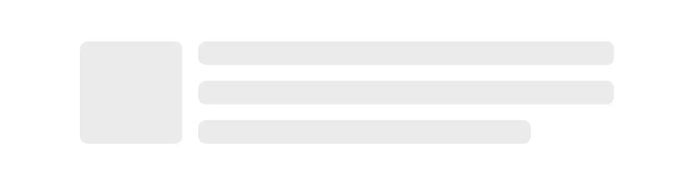
Now that we have the basic building blocks, let’s create a more complex skeleton loader. Let’s say we want to include a profile image with three lines of text next to it.
For that we’d create a few grid containers to lay out the content. The code for the skeleton loader might look like this:
<div class="skeleton">
  <div class="image"></div>
  <div class="lines">
    <div></div>
    <div></div>
    <div></div>
  </div>
</div>

<style>
  .skeleton {
    border: 1px solid black;
    padding: 2.5rem;
    width: 80%;
    * {
      border-radius: 0.5rem;
    }
  }
  .skeleton {
    display: grid;
    grid-template-columns: auto 1fr;
    gap: 1rem;
  }
  .lines {
    display: grid;
    gap: 1rem;
    > * {
      height: 1.5rem;
      &:last-child {
        width: 80%;
      }
    }
  }
  .image {
    aspect-ratio: 1;
  }
</style>
If you try this, you’ll notice that the lines results in a single gray rectangle
(CodePen). This is expected,
as our .lines wrapper div is treated the same as the other elements.
To fix this, we can add a .wrapper class to these elements to exclude them
from being rendered as placeholder boxes. Here are the changes needed in our
.skeleton css class:
.skeleton {
  :not(.wrapper) {
    /* ... */
  }
}
Now, we can simply add the wrapper class to the .lines div, and it will no
longer be rendered
(CodePen).
Final Code
To sum it up, here is the complete final code of the .skeleton css class:
@keyframes skeleton-shimmer {
  0% {
    background-position-x: 200%;
  }
  100% {
    background-position-x: 0%;
  }
}
.skeleton {
  display: contents;

  /* Define the colors as css custom props */
  --_default-color: #e8e8e8;
  --_shimmer-color: #fff;

  :not(.wrapper) {
    /* Apply the animation that moves the background */
    animation: skeleton-shimmer 2s ease-out infinite;

    /* Create a background that has a small shimmer "stripe"
      and tilt it 100 degrees. */
    background: linear-gradient(
      100deg,
      var(--_default-color),
      var(--_default-color) 50%,
      var(--_shimmer-color) 60%,
      var(--_default-color) 70%
    );

    /* Make the background twice the width so we can offset it. */
    background-size: 200% 100%;
    background-attachment: fixed;
  }
}
Accessibility
When adding a skeleton loader, you should make sure that you use the
aria-live="polite"
and
aria-busy
attributes to make screenreaders properly handle your content.
Bonus Svelte Component
Here is a Svelte implementation
of this idea. There is <Loading> component that sets the appropriate aria-
attributes and renderes the <Skeleton> component while it’s loading.
This implementation allows you to add a skeleton loader like this:
<Loading {data}>
  {#snippet loaded(data)}
    <!-- Will be rendered when `data` is set -->
    {data}
  {/snippet}

  {#snippet skeleton()}
    <!--
      Uses the <Skeleton> component to render the
      skeleton when `data` is undefined
    -->
    <div class="wrapper lines">
      <div></div>
      <div></div>
      <div></div>
    </div>
  {/snippet}
</Loading>
Of course there are multiple ways to approach this, so feel free to play around with it and maybe you’ll find something that suits you better.
Need a Break?
I built Pausly to help people like us step away from the screen for just a few minutes and move in ways that refresh both body and mind. Whether you’re coding, designing, or writing, a quick break can make all the difference.
Give it a try